One thing about me is that I love software that is lightweight and powerful. Lightweight meaning that it takes up a small amount of RAM, loads quickly and shuts down just as fast. Powerful meaning it does everything I want it to and more, without being too complicated. Stability is a third criteria that is also important (stability meaning it doesn't stop responding every 5 seconds) factor that I consider when trying out new software and deciding on whether to keep it or not. This is in stark contrast to
bloatware.
When I recently
upgraded my PC to a SSD I decided that the time had come for me to go "Apple free": Remove any and all Apple software from my system. I had previously owned two iPods in the past (A 20gb, 4th generation and an 8gb 3rd generation Nano) which I had mixed feelings about. Since I bought my Samsung Galaxy SII, I have used it for all of my music and video playback and so no longer needed my little Nano and consequently sold it: I had become Apple (hardware) free. However, I continued to use iTunes because I had spent so much time in the past cleaning up my music library within it so that there was ample metadata for each track including correct album artwork for every song. Another reason I didn't want to change was because I didn't want to lose my play counts. The last reason was because I hadn't yet found a decent alternative.
It is not difficult at all to sync your iTunes music library with an Android phone. There are many, many methods and pieces of software that will allow you to do it including
DoubleTwist and
iSyncr. I was using a simple piece of software called
NotPod (Formerly iTunes Agent) as it allowed me to only sync specific playlists with my phone. I recommend it for it's simplicity although many users may find it too simplistic.
The time had come for me to find a new music library manager. It's worth noting that my music library is reasonable (about 18 GB in size) and I only looked at free software that runs on Windows. These are the following I looked at or tried:
1. Songbird
I actually had Songbird installed while I had iTunes installed with the plan of migrating to it over time. This piece of software not only looks very similar to iTunes, it also had plenty of skins or "feathers" as they are known in Songbird to make it look nigh on identical to the Apple equivalent. The main drawcard of Songbird is the Add-Ons. Much like
Mozilla's Firefox (my browser of choice!) the ability to install Add-Ons to further customise the look and feel of the player as well as add functionality to the software is a huge benefit to those who like to fiddle around until it is "just right" for their own use.
Unfortunately, I never made it to using Songbird as my sole music player/library manager for a few reasons. First is that it was very slow and cumbersome and took quite some time too boot up. Second is that the look of the player was slightly odd with miscoulored menu items and just didn't have the general polish I look for. The benefit of Add-Ons was all but removed as barely any of them were supported in the latest versions. Finally, the general feeling that Songbird was not really being used by anyone and was not being developed very quickly was the final nail in it's coffin for me.
 |
| Songbird. Too slow with a general feeling of neglect. |
2. Windows Media Player 12
Windows Media Player may seem like an obvious choice for a Windows user looking for an iTunes alternative. For some reason, I had never really liked WMP after the version that came pre-packaged with Windows XP and have since instead used the K-Lite codec pack which included "Media Player Classic" - A player that is almost identical to the WMP of Windows 95 and 98.
While WMP12 seems to do the job fine and while I usually don't mind pre-packaged Windows software for the plain fact that they are already there, there's something stopping me from using WMP12 to manage my music. Maybe it's the look, maybe it's the feel, maybe it's too simplistic or maybe it's too different. I'm not sure on this one.
 |
| Windows Media Player 12. Unfairly ignored? |
3. MediaMonkey
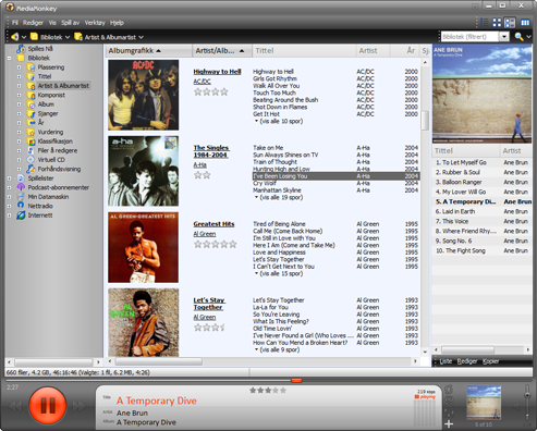
I tried MediaMonkey after good reviews I read online. It seemed to do the job- Imported all of my music just fine and looked alright. The main gripe I had with MediaMonkey is that it was just far too complicated once you wanted to start customising things. One of the first things I always do when I install software is jump to the options or settings menu just to see what I can fiddle with. MediaMonkey was loaded to the hilt with settings and customisations- to the point where it was just overkill.Just looking through the settings menu let alone changing anything seemed like an ominous task and scared me off.
Aside from this, MediaMonkey seems like a decent program but I think there are better ones out there. This software seems to be stuck between being a "mainstream player"and one for the hardcore audiophiles with tens or hundreds of gigabytes of music files. The layout also put me off, with controls at the bottom of the window in a semi-transparent background and seemed a bit unstable. Even performing basic tasks seemed quite difficult to me but maybe that's because I'm still just so damned used to iTunes after using it for so long.
 |
| MediaMonkey. Too many options. |
4. MusicBee
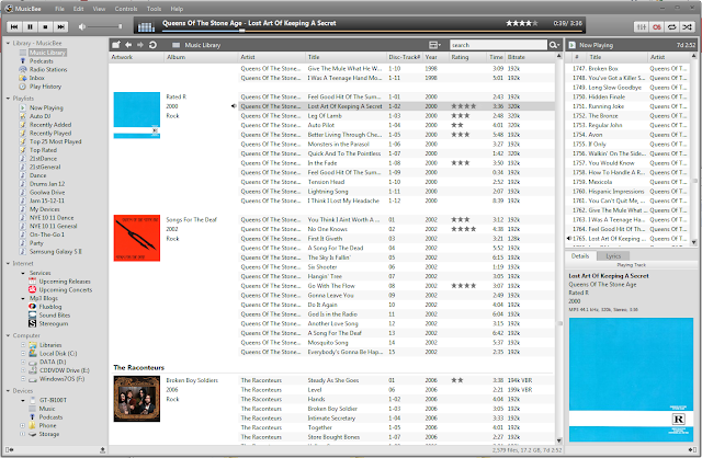
After trying to find a nice iTunes replacement, I finally came across MusicBee. While I was a little bit skeptical at first based on it's name alone, soon after installing it I knew I was going to like it. Similar interface to iTunes but with a nice amount of customisation, I soon had it set up and running just the way I like it. It booted up not rapidly but after an acceptable amount of time and runs quickly and stable. It imported my iTunes library without a hitch including playlists and play counts. The
Last.fm integration amongst other similar services is a nice touch.
There is ample pre-installed customisation options and skins so you can get the player looking just how you like it. It handles Android (and iPod so I've read) synchronisation with ease and includes podcast management. So far the only real downfall is that it has no video support but that was never really on my list of requirements anyway.
 |
| MusicBee. That's the one we wanted! The skin I'm using in the above screenshot is Smooth Grey in the Neutral category. |
So there you have it! My recommendation to those looking for an iTunes alternative or just looking for a solid, well designed player with the perfect amount of customisation?
MusicBee.
Other software I tried or looked at in my search for the best music software:
Winamp
- The first software I ever used to manage my music library
- Ample customisation including thousands of skins for any look you want (retro, modern, ugly...)
- Interface looks cheesy and dated to me
- Very versatile software with lots of plugins
Foobar2000
- Yet to try it for myself
- Looks very simplistic
- Very lightweight, loads very quickly
- Very different to what I'm used to
Tomahawk
- New software with ever growing hype
- "The social media player" integrates many online services such as Spotify, Youtube, Last.fm and Soundcloud into one location
- Very different interface and found it hard to use with existing music files- better suited to streaming services
- Software with huge potential and one I'll be keeping my eye on


